Soteria Re is a Bermuda-based reinsurance company created by Fidelity Investments to deliver highly customized risk solutions to a sophisticated global client base. The challenge was to build a brand that could signal both institutional strength and tailored partnership—without defaulting to category clichés.
I led the brand strategy and visual identity development from the ground up. In close collaboration with a writer, we defined the value proposition, brand pillars, and voice—establishing a foundation that positioned Soteria Re as both technically rigorous and deeply client-centric.
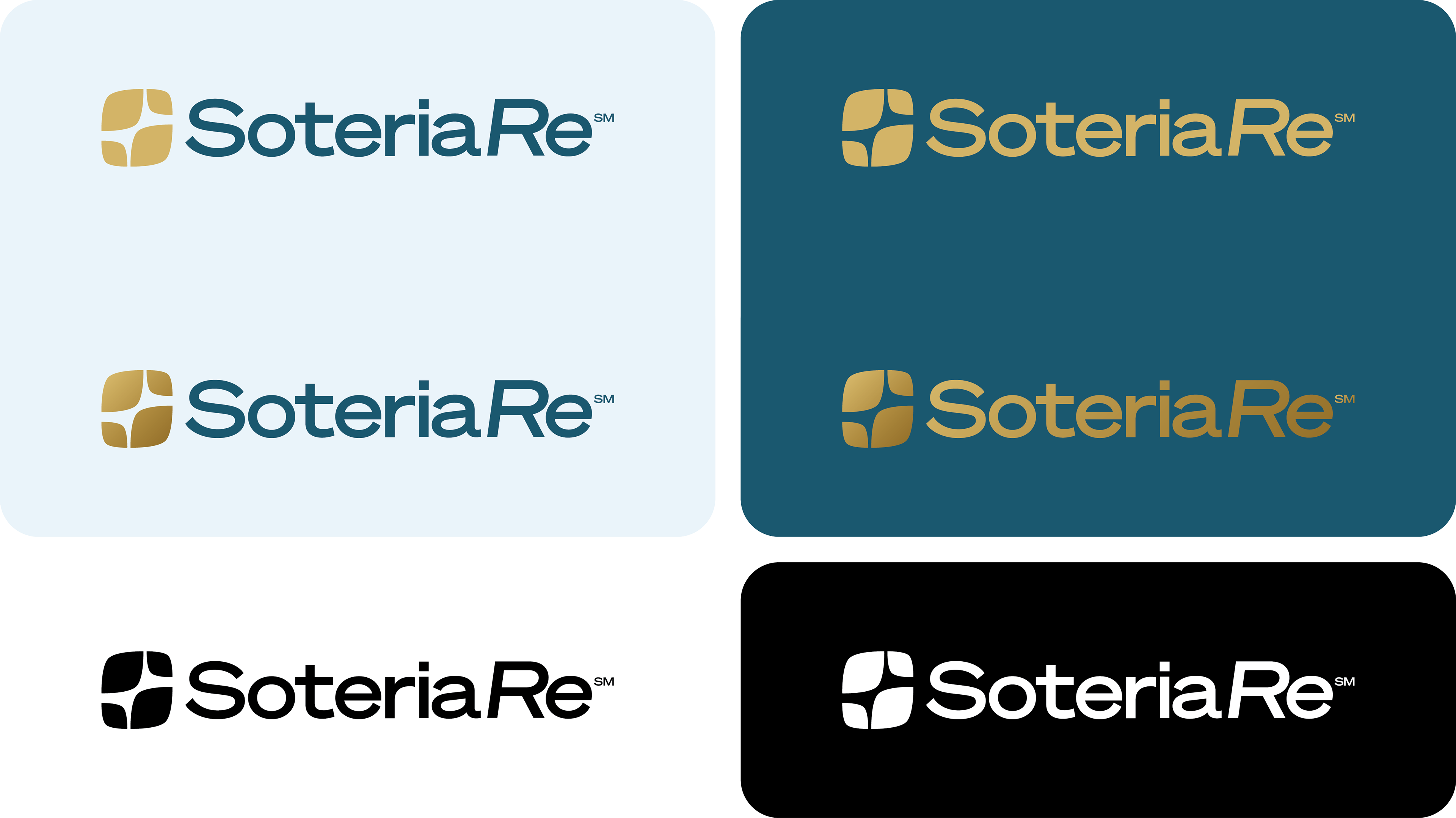
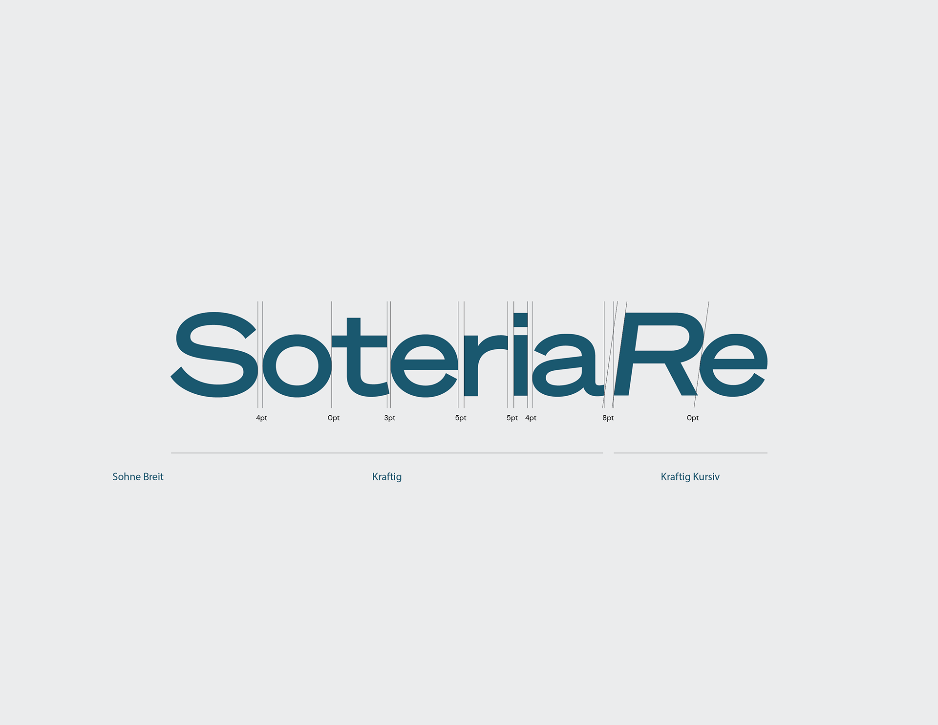
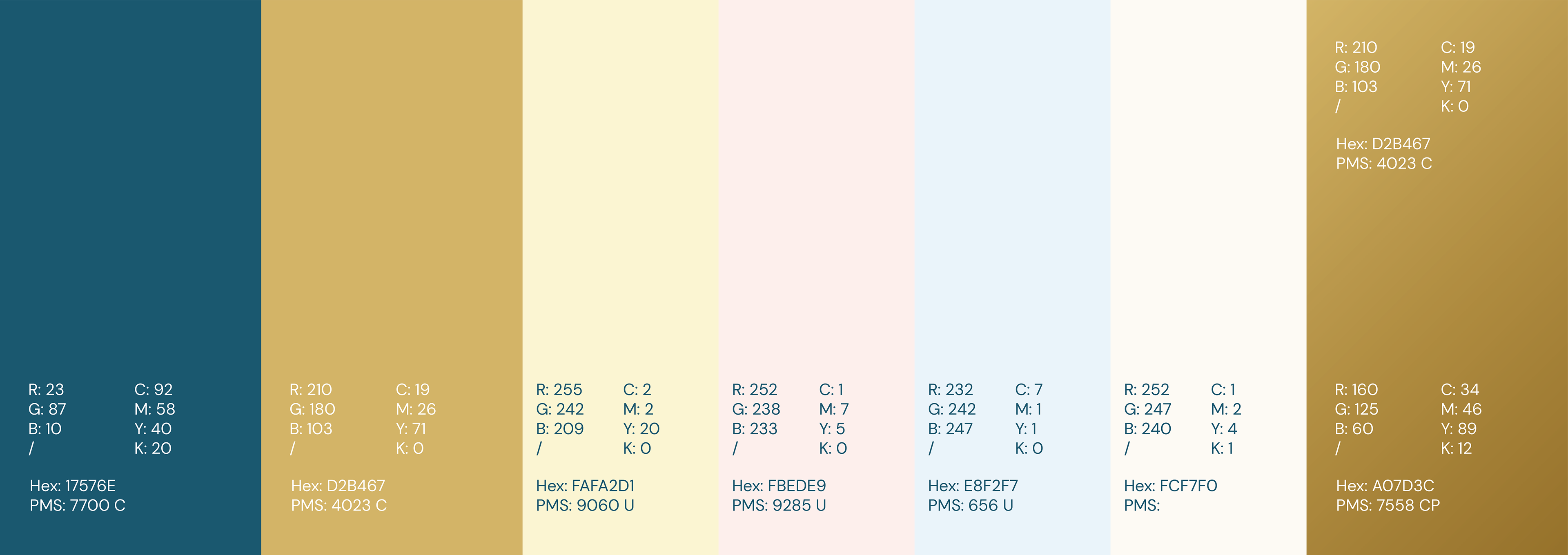
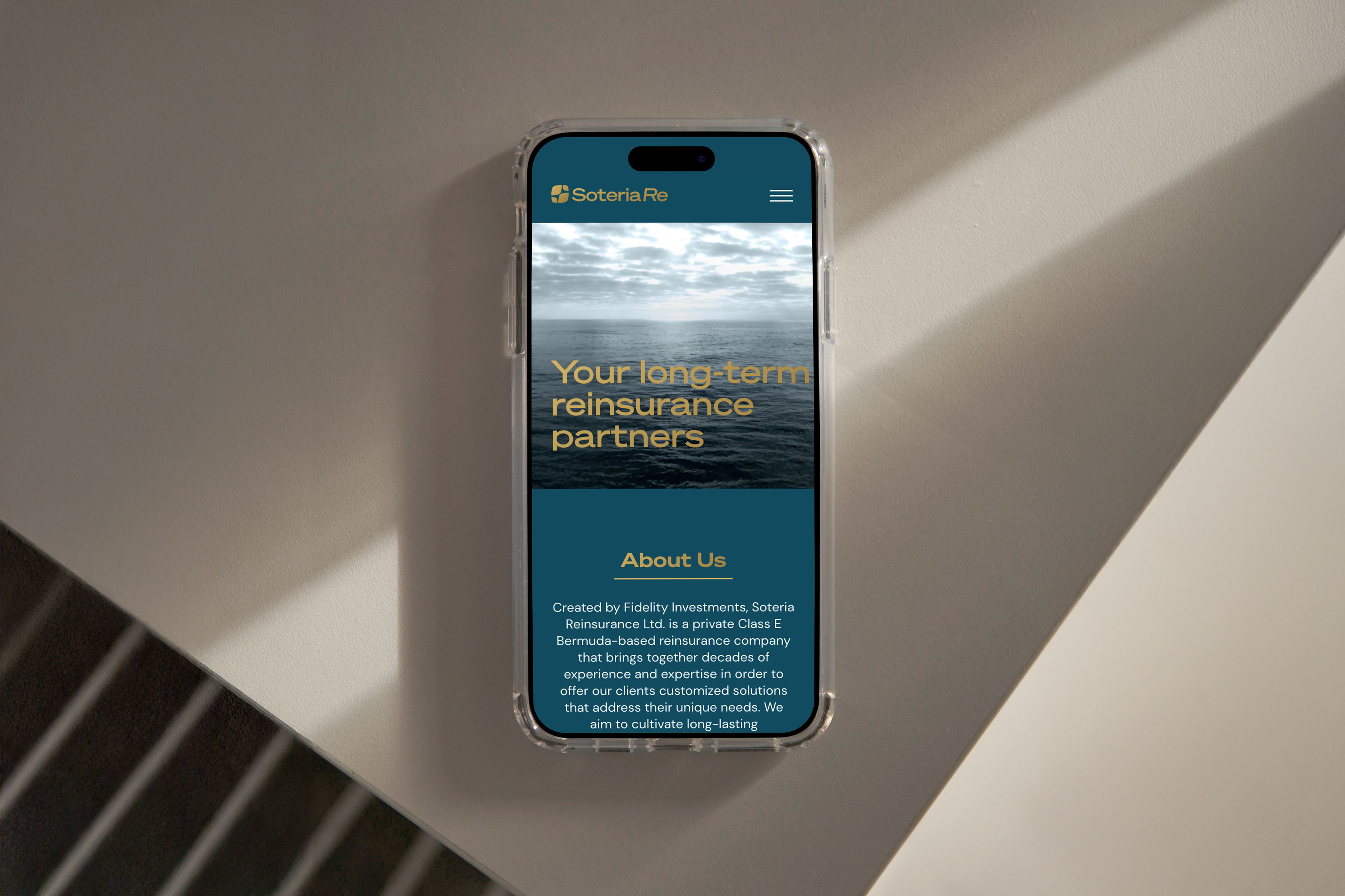
From there, I directed the full identity system, including logo, digital experience, and print collateral—ensuring consistency across every touchpoint.
The mark itself distills the brand’s core ideas: protection, balance, and partnership—into a simple, ownable form. Inspired by the concept of Soteria (safety and preservation), the identity avoids industry tropes in favor of something more refined and enduring, helping the company stand apart in a traditionally conservative space.
The result is a cohesive brand that reinforces credibility at every level while giving Soteria Re a distinct presence in a crowded, often indistinguishable category.